Exploring the Power of Colour
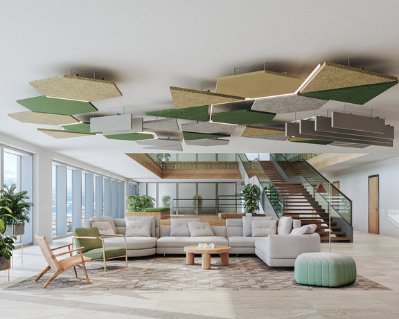
Colour affects the design and personality of a space. If we delve into Colour Psychology—which is the study of how colours affect human behaviour, mood and other psychological processes—it is proven that colour can influence our buying choices, our feelings and even our memories.
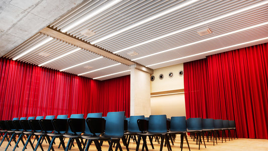
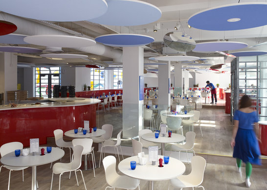
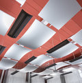
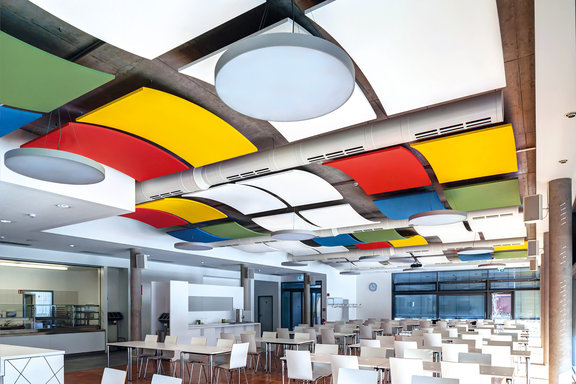
Take reds, for instance. They are said to stimulate a powerful response from people, increasing their mental energy and metabolism. While blue calms and relaxes, reducing stress in the workplace.
People are now expecting more contentment in their lives and it’s no surprise that wellness in the workplace is a trend on the rise. Post pandemic, employees expect a flexible workspace designed to stir collaboration and stimulate ideas.
Hence why we’re seeing an increase in spaces designed to enhance health and wellbeing while still meeting practical and business-relevant demands.
Why colour choice matters
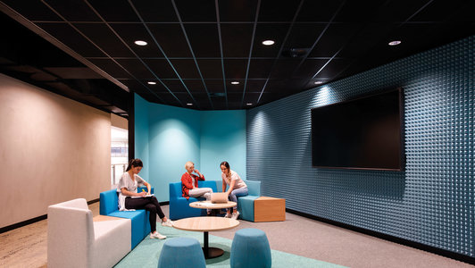
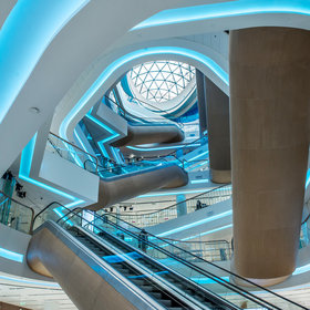
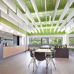
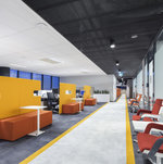
Consider using blue in well-lit environments. Blue helps improve productivity and alertness, creating workspaces that welcome employees and stimulate their minds. Its calming yet stimulating nature is ideal for busy offices and transport hubs, creating a sensation of space.
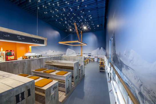
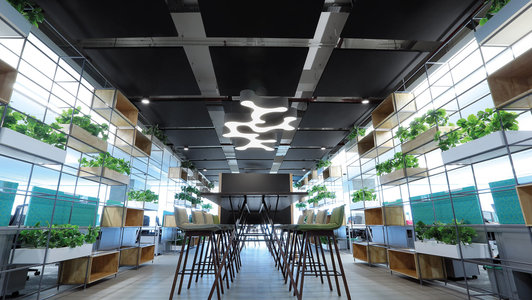
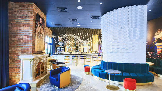
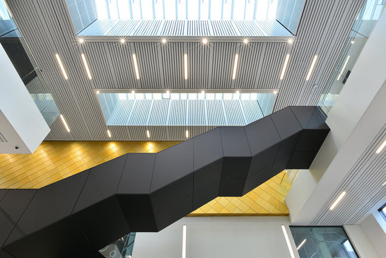
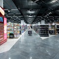
Make a lasting impression with black to provide sophistication and elegance.Hospitality and retail spaces will benefit from a dim ambiance to create an intimate atmosphere. When you enhance the darkness, you emphasise the light—creating a powerful contrast that puts focus where it needs to be, and transform the conventional into a high-end, modern look.
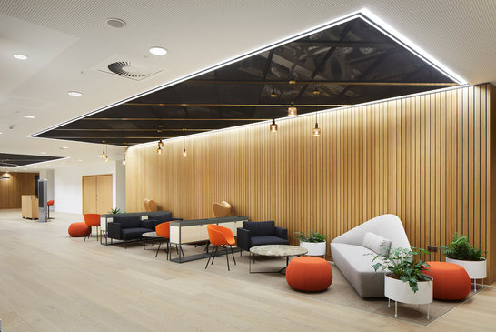
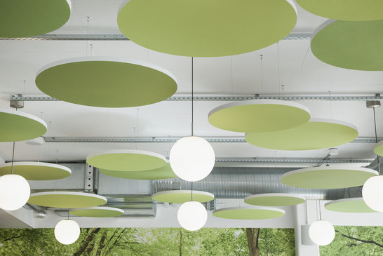
As wellness continues to grow in importance as a defining factor in building and interior design, there is a great opportunity to refocus and analyse how we design more holistic, colourful spaces to enhance end user comfort, wellbeing, and productivity.
Knauf Ceiling Solutions offers a diverse range of mineral, metal, mesh, wood and wood wool materials to face every design or architectural challenge.
